Jupyter Notebook
Jupyter allows you to easily combine markdown and code into a combined canvas view called a notebook. There are several tools that allow you to edit and run code in a Jupyter notebook. This guide will get you setup using VSCode to create a Jupyter notebook that pulls data from the VulnCheck API using the Python SDK and display a chart using that data.
VulnCheck's Jupyter Notebook Library
We maintain a collection of Jupyter Notebooks that we build with VulnCheck data that can be accessed on Github: https://github.com/vulncheck-oss/jupyter-notebooks
Initial Setup
Microsofts VSCode Guide for Jupyter Notebooks is where you should start to get your development environment setup and ready to work with Jupyter. You should read enough to be able to execute a cell that displays "Hello, World!". Once you're confident with that, continue with this guide.
An Example Notebook
- Create a new notebook, let's call it
botnet.ipynb - Let's add our first cell and install our dependencies in it.
%pip install vulncheck-sdk matplotlib pandas
- Now let's add another cell below to grab data from the VulnCheck API using the SDK. Copy the following code block (replacing the
TOKENvalue with your own) into the cell and execute it.
import vulncheck_sdk
import matplotlib as mpl
import matplotlib.pyplot as plt
import pandas as pd

DEFAULT_HOST = "https://api.vulncheck.com"
DEFAULT_API = DEFAULT_HOST + "/v3"
TOKEN = "insert_token_here"  # Replace with your actual API token

configuration = vulncheck_sdk.Configuration(host=DEFAULT_API)
configuration.api_key["Bearer"] = TOKEN

with vulncheck_sdk.ApiClient(configuration) as api_client:
    indices_client = vulncheck_sdk.IndicesApi(api_client)

    api_response = indices_client.index_botnets_get()

    botnet_names = []
    cve_count = []

    for entry in api_response.data:

        # For this example, let's check out each botnet and the number
        # of unique CVEs associated with it.
        botnet_names.append(entry.botnet_name)
        cve_count.append(len(entry.cve))

df = pd.DataFrame({
    'Botnets': botnet_names,
    'Unique CVEs': cve_count
})
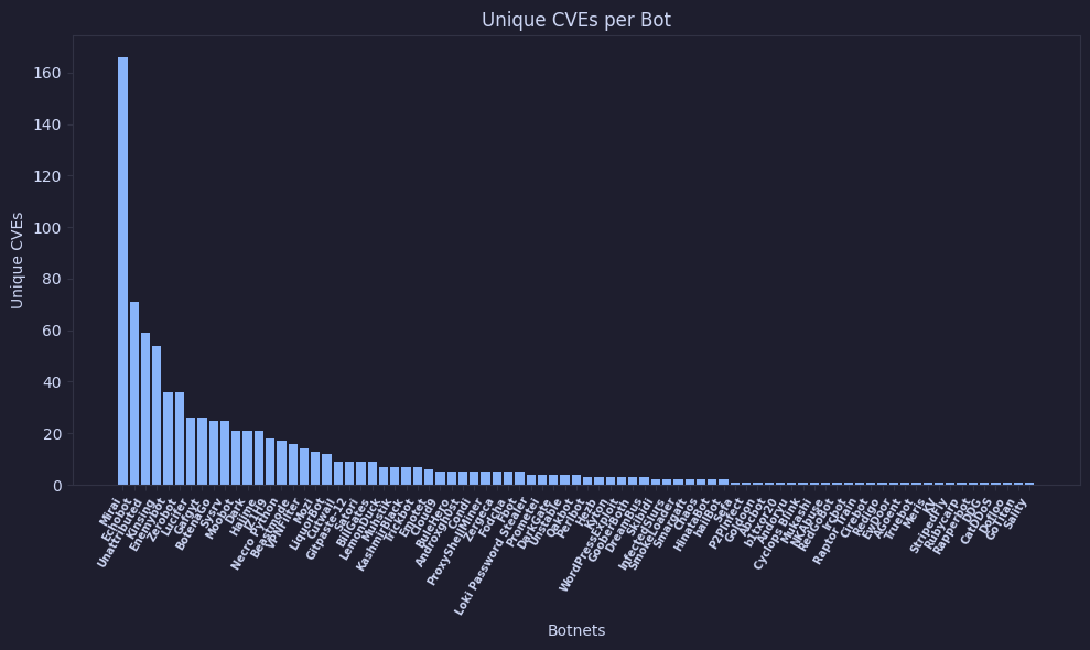
After executing this cell, we'll have all of our data in a pandas DataFrame object which we can pass to our matplotlib chart for visualizing. Let's do that next!
- Create another cell, copy the codeblock below and execute it.
df_sorted = df.sort_values(by='Unique CVEs', ascending=False)
plt.figure(figsize=(10, 6))

plt.bar(df_sorted['Botnets'], df_sorted['Unique CVEs'])

plt.title("Unique CVEs per Botnet")
plt.xlabel("Botnets")
plt.ylabel("Unique CVEs")

plt.xticks(rotation=60, ha='right', fontsize=7, fontweight='bold')

plt.tight_layout()
plt.show()
You should see something like this:
